Information and Communication
Why Audio Description Matters: Making Visual Content Accessible to All
March 17, 2025 Imagine watching your favourite film, a live sports event, or a breaking news segment without being able to see the screen. You can hear the dialogue, music, and background noise, but key visual details, like expressions, actions, and scene changes, are missing. For people who are blind or have low vision, this… Read More about “Why Audio Description Matters: Making Visual Content Accessible to All”
Top Resources for Creating Accessible Digital Content in 2025
February 25, 2025 Accessibility in digital content isn’t just a legal requirement—it’s a moral and business imperative. Ensuring that websites, documents, and social media content are accessible means opening doors for a larger audience, including people with disabilities. But where do you start? We’ve compiled a list of top resources to help individuals and businesses… Read More about “Top Resources for Creating Accessible Digital Content in 2025”

Seeing with Sound: A Life Worth Living’s Audio Description Course
December 2, 2024 Imagine watching your favourite movie without visuals—no sweeping landscapes, subtle expressions, and vibrant costumes. For people with vision loss, this is often their viewing experience. But what if the visual world could be made verbal, with each scene brought to life through words alone? This is where audio description comes in, and… Read More about “Seeing with Sound: A Life Worth Living’s Audio Description Course”
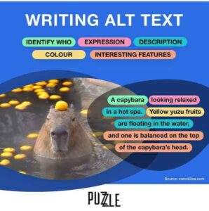
How to Write Alt Text and Image Descriptions for the Visually Impaired
Over the last few years, Veronica Lewis has become a leading expert in how to write alt text and image descriptions for the visually impaired, inclusive of blind/low vision audiences.

Looking for your image?
For 2.2 billion people in the world with sight loss it’s not always that easy.
Often the ALT TEXT they rely on to describe an image to them is either non-existent, or just a bit rubbish.
Writing a description to every image you post gives everyone a fuller picture.
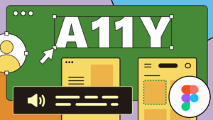
New Ideas and Unique Solutions from Figma on Accessibility
For those who aren’t familiar with it, Figma is a tool that allows people to share and collaborate on designs for digital products and experiences. Changes are propagated in real time. Think of it as Google Docs for designers.
Beyond Compliance: Accessibility in Multifamily
In the multifamily industry, we have all heard of the Americans with Disabilities Act (ADA). We have policies in place for it. It is referenced, stated, and explained in our training courses, onboarding materials, and development plans.
I’ve received the results of my accessibility audit – now what?
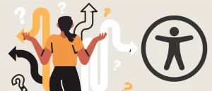
So, you’re just getting started on your accessibility journey and you’re wondering what your first few steps should be. Great! Know that most organizations typically start with an accessibility audit, which provides a benchmark for their digital content.
Making A Strong Case For Accessibility
Imagine yourself as someone with a visual disability. Cataracts, or totally blind even. A site is not accessible because of many factors, willing and unwillingly. Accessibility may have been attended to at the end of the project or not in the budget, or maybe they just didn’t practice it. You can’t access the vital information on the site because it’s not accessible to people with visual disabilities.

Usability & Web Accessibility – Assistive Technology
People with certain disabilities use display and input technologies to access online resources. There are several software and hardware solutions that have been adopted, commonly referred to as assistive technologies.

