Designing for Dyslexia
By Stephanie Asmus | Medium, February 8, 2021
An estimated 10% of the population has dyslexia. That’s 32.9 million Americans and 764 million people worldwide. Researchers suggest the numbers could actually be much higher, many people simply go undiagnosed. Either way, we know there are hundreds of millions of people with dyslexia.
We also know dyslexia is not something children grow out of, rather a difficulty adults learn to cope with. As a designer, this means we can expect around 10% of our users to require certain design considerations to ensure an adequate user experience. Failing to take in the considerations of dyslexic users is neglecting at least 10% of your audience.
What Is Dyslexia?
Dyslexia is not a visual processing issue, it’s a language processing issue. Individuals with dyslexia have the same intelligence as those without dyslexia, they simply process language differently and often have a hard time connecting letters to the sounds they make. Because it’s difficult to associate the “mmmmmm” with “M” or “buh” with “B”, it’s hard to recognize short, familiar words, or sound out longer words. Notable symptoms consist of difficulty reading and mixing up letters in a word.
Designing for Dyslexia
While there are several dyslexia-specific things you can do to help someone with dyslexia better process language, I have pulled out the 10 tips that will make your website more inclusive to dyslexic users while improving usability overall. These are simple best practices you can incorporate into your designs without any dramatic changes.
1. Sans-Serif Fonts
I have previously laid out general rules for typography. However, with dyslexia, the guidelines are a little different. Individuals with dyslexia have a harder time recognizing the difference between the shapes of letters and feel characters tend to run together. Where serifs help many follow along better, they distort the shapes of letters for users with dyslexia.
When able, use a common sans serif font such as Arial, Verdana, or Tahoma. Research suggests using a familiar sans serif font can increase readability even better than a dyslexic-specific font, simply because the reader has learned to identify the shapes within these more common fonts.
2. Larger Font
Regardless of serif vs. sans serif, using a larger font is incredibly helpful for dyslexic readers. According to the British Dyslexia Style Guide, font size should be 16–19px (12–14pt).
3. Adjust letter/word spacing
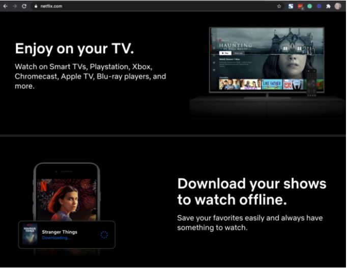
Another way to improve readability regardless of the font you’re using is to slightly reduce the spacing within the word (tracking) while expanding the spacing between words. This helps the reader to better group and separate individual words.
4. Avoid Italics or Underline
Typically when we want to italicize or underline a word, we want to add emphasis to it. However, text decorations such as italics or underlines can have the exact opposite effect for a dyslexic reader and instead make the word illegible. Instead, use bold to emphasize important words.
5. Limit Line Length
All of your users will benefit from shortening how far across the page a line goes. The general consensus is to limit the length of your lines to 45–100 characters. Longer than that and the sentences and paragraphs become hard to follow.
6. Avoid Carousels and Rotating Text
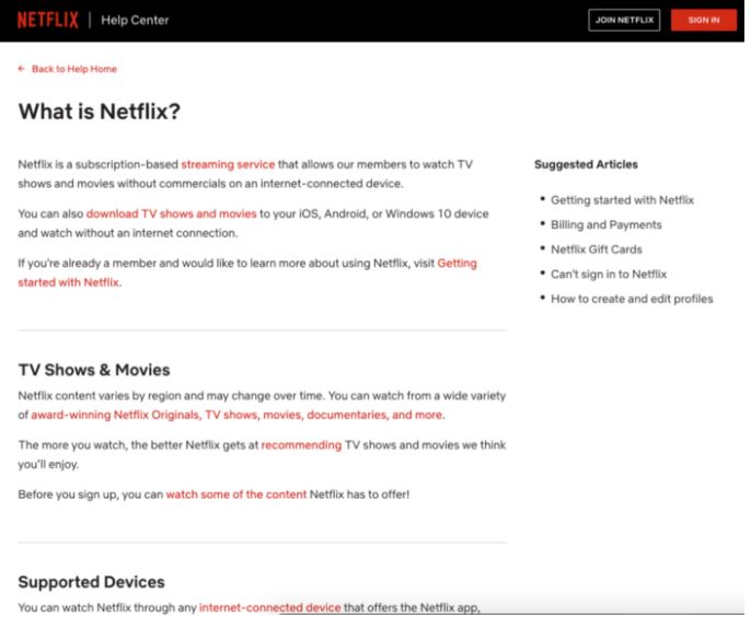
In general, rotating carousels and banners are a bad idea. They tend to have low conversion rates and create an effect called “banner blindness” where users ignore them. Dyslexic users tend to be slower readers, so having scrolling text is s double bad idea. Give your users the opportunity to go at their own pace and don’t force your pace on them with auto-rotating text.
7. Use visual cues where possible
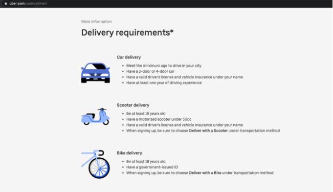
Since it does take dyslexic readers a little longer to read through copy, try incorporating visual cues such as icons and imagery so the reader can more quickly scan the page for the information they’re looking for.
8. Lower the Contrast
Research shows black (#000000) copy against a white (#FFFFFF) background is less accessible than say a dark grey on an off-white background. To make your site more accessible, try reducing the contrast. Even using a dark grey font against white is more helpful than pure black against pure white.
9. Don’t Rely on Your Search Tool
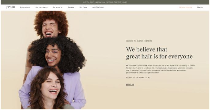
Search tools in the navigation bar are a wonderful thing; however, do not rely solely on them when designing your site’s navigation as a way for users to find what they need. A desirable trait of dyslexia is unique problem-solving. Your dyslexic users are going to connect the dots a little differently than their peers. Even if your search tool is equipped to handle misspelling (which would be likely), you’re relying too heavily on the user to know what to search for.
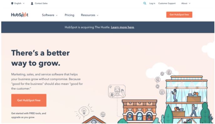
Instead of a super minimal navigation and a search tool, you want to have a flexible navigation, which is achieved when there are a variety of paths and user flows that lead to the same destination.
10. Include a Sitemap
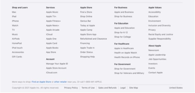
Piggy-backing on #9, you want to include access to the sitemap at the bottom of your website. This gives everyone a chance to see all of their options and choose exactly where they want to go if any of the user journeys designed for them didn’t work out.
Conclusion
When it comes to designing for dyslexia, everyone’s challenges are unique and varying. There isn’t going to be a one-size-fits-all solution. However, these 10 best practices work to make your website more readable and accessible to everyone, and that’s always a good thing.
About This Article:
A Life Worth Living has copied the content of this article under fair use in order to preserve as a post in our resource library for preservation in accessible format. Explicit permission pending.
Link to Original Article: https://medium.com/branding101/designing-for-dyslexia-9e61945f82b0

