
Android accessibility: roles and TalkBack
By Graeme Coleman | Tetra Logical, July 7, 2022
TalkBack only announces role information for a relatively small number of user interface (UI) elements within native apps. When comparing this behaviour against web content, this can often give the (false) impression that these elements must have been coded incorrectly and therefore need to be “fixed”.
This blog post looks at when it is acceptable for a role not to be announced, the roles that TalkBack does announce, and what this means for conformance to the Web Content Accessibility Guidelines (WCAG).
Brief refresher on roles
A role defines a UI element’s type, such as a heading, button, slider, checkbox, and so on. When coded correctly, a screen reader will normally announce the element’s role, so people using those technologies know what the element is and how they can interact with it.
Most development environments include elements where the role is automatically set and conveyed by a screen reader. Examples include <input type="checkbox"> for checkboxes in HTML, and <Button> for buttons in native Android applications. On encountering these elements, a screen reader will announce “Checkbox” and “Button” respectively when the element receives focus.
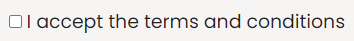
A typical native checkbox in HTML
<input type="checkbox" id="terms">
<label for="terms">I accept the terms and conditions</label>
A typical button in an Android app
<Button
  android:id="@+id/my_button"
  android:layout_width="wrap_content"
  android:layout_height="wrap_content"
  android:text="@string/my_button_text"
/>
In some cases, particularly for custom components or where an appropriate native element is not available, developers must manually identify the role. For web-based content, this is achieved using WAI-ARIA. For native Android apps, an appropriate attribute needs to be added to the view in XML, for example applying android:accessibilityHeading="true" to indicate that a TextView represents a heading.
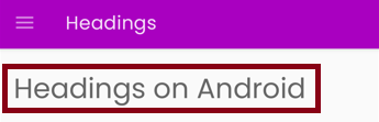
A typical heading in an Android app
How role announcements differ within native apps and on the web
If you use a screen reader such as TalkBack to navigate web content, it will announce an appropriate role for almost all UI elements on the page. These elements include:
- Static items such as headings, lists, tables
- Interactive controls such as buttons, checkboxes, form fields
- Custom components such as menus, dialog boxes
On the other hand, when using TalkBack to navigate within a native application, you will notice that only certain roles are announced.
For example, on encountering a <Button> element, TalkBack announces the following:
[button label], button, double-tap to activate
However, on encountering an <item> element, which is used to mark up actionable menu items in a hamburger menu, TalkBack announces the following:
[menu item text], double-tap to activate
Here, TalkBack makes no reference to the role of the element (a menu item) at all.
Why the lack of role information is not necessarily a problem
Given the above behaviour, you may be tempted to think the latter does not meet WCAG 2.1 Success Criterion 4.1.2 Name, Role, Value (Level A). However, there are a few reasons, some of which are discussed below, as to why this is the wrong position to take.
A misinterpretation of the success criterion’s requirements
Success Criterion 4.1.2 Name, Role, Value requires developers to make sure that UI elements are coded in such a way that the correct role can be programmatically determined by an assistive technology. It does not actually specify the extent to which an assistive technology conveys this information – this is up to the assistive technology itself. To illustrate, when TalkBack encounters an element it recognises to be actionable based on a developer’s coding decision, it will (normally) announce “double-tap to activate”, whatever the underlying role is. Indeed, it is possible for people who use TalkBack to disable this hint, so there is no guarantee it will be announced in the first place. Regardless, this is entirely outside the scope of the success criterion, and not the responsibility of an app developer to “fix”.
TalkBack is programmed to only announce certain roles
Because the TalkBack code is open source, it is possible to identify the actual roles that are announced in the file Role.java. At the time of writing, these roles are indicated in the Role class and include buttons, alert dialogs, toasts, and so on – but not (for example) menu items.
Potential redundancy of role announcements within native apps
When navigating web content, understanding each element’s specific role is often necessary in order to know how to interact with it. For example, on hearing that an element is a link, someone using a screen reader will then know to press the Enterkey to open the link. For buttons, they will know to press the Enter key or Spacebarto trigger the related action. And for menus, they will know how to use the arrow keys to navigate between menu options.
On the other hand, mobile applications require far fewer gestures. Triggering a link, button, or menu item when TalkBack is active requires the same gesture: double-tapping the screen. Of course, it would be helpful if TalkBack was more explicit in terms of what will happen when this gesture is triggered so as to distinguish between element types, but there is a balance to be had between giving people just enough information to perform an action and overwhelming them with announcements.
What this means for conformance
In summary, if TalkBack doesn’t announce the role of a element, it doesn’t necessarily mean that the element fails to meet Success Criterion 4.1.2 Name, Role, Value. Instead, we offer the following guidance.
Use native elements where possible
Elements such as <Button>, <CheckBox>, <Spinner>, <menu>, <item>, and so on all have the required semantics and behaviour built in by default.
Furthermore, even though the role may not necessarily be announced by TalkBack, it will automatically convey instructions for operating all of the elements when they receive focus.
For custom user interface elements, we recommend that you extend a related native element so that the base semantics and behaviour are carried over into your customised version.
For <TextView> elements that represent headings, make sure that the android:accessibilityHeading attribute is set to true on the element.
Use the correct native element
If TalkBack announces “double-tap to activate” when it encounters non-actionable plain text, it is likely that an incorrect element has been used to generate this content. In such cases, this is a failure against Success Criterion 4.1.2 Name, Role, Value, as the content will ostensibly have an actionable role even though it is non-actionable in practice.
Avoid including the role manually
While it may be tempting, we recommend against manually adding role information in text to elements whose role isn’t announced by default (for example through the android:contentDescription attribute). This is because, should TalkBack be updated to include additional role announcements, it will either announce role information twice (resulting in duplication) or, if the role name you choose is slightly different, will cause multiple roles to be announced. Refactoring the code to fix this is likely to require significant and costly effort.
Customize the default usage hint where appropriate
In cases where a widget requires actions that go beyond the default “double-tap to activate” usage hint, make sure to add those actions using the setAccessibilityDelegate method. This is particularly important for custom controls in which additional actions are required to operate the control – not doing so could potentially be deemed a failure against the related WCAG success criterion.
For example, the following (Kotlin) code snippet demonstrates how the default usage hint can be modified to announce “Double tap to edit text, double tap and hold to copy text” when the related control receives TalkBack focus.
ViewCompat.setAccessibilityDelegate(myCustomControl, object: AccessibilityDelegateCompat() {

  override fun onInitializeAccessibilityNodeInfo(v: View, info: AccessibilityNodeInfoCompat) {
    super.onInitializeAccessibilityNodeInfo(v, info)
    info.addAction(
      AccessibilityNodeInfoCompat.AccessibilityActionCompat(
      AccessibilityNodeInfoCompat.ACTION_CLICK, "Edit text"
    ))
    info.addAction(
      AccessibilityNodeInfoCompat.AccessibilityActionCompat(
      AccessibilityNodeInfoCompat.ACTION_LONG_CLICK, "Copy text"
    ))
  }
})
Related standards
More information
- Android Developers: Build more accessible apps
- Android Developers: Principles for improving app accessibility
- Microsoft: Android Accessibility – Resolving common TalkBack issues
Next steps
If you want to learn more about how to use TalkBack to navigate through both native app and web content, read Browsing with a mobile screen reader.
Additionally, we offer both instructor-led training and self-led training on accessible mobile development and QA for both iOS and Android operating systems. Please get in touch if you would like to find out more!
Updated Monday 11 July 2022 to indicate that the “double-tap to activate” hint can be disabled, to clarify that interactive elements perform different actions when activated, and to suggest developers customize the default hint where appropriate. Thanks to Joe Humbert (@JoeHumbert) for his feedback.
About This Article:
A Life Worth Living has copied the content of this article under fair use in order to preserve as a post in our resource library for preservation in accessible format. Explicit permission pending.
Link to Original Article: https://tetralogical.com/blog/2022/07/07/android-accessibility-roles-and-talkback/