Accidental Dismissal of Overlays: A Common Mobile Usability Problem
By Raluca Budiu | Nielsen Norman Group, September 18, 2022
Summary: Overlays often need to be dismissed in a manner that goes against users’ expectations.
Overlays have become a ubiquitous UI element on mobile: beyond the annoying popups for cookie permissions, chat bubbles, coupons offerings, and marketing-subscription offers, you will also find them used for navigation menus, bottom sheets, product-detail pages, or in-app browsers.
While many mobile overlays take up only a section of the page (partial overlays), allowing some content to be visible in the background, others occupy the full screen and are practically indistinguishable from a regular page or view.
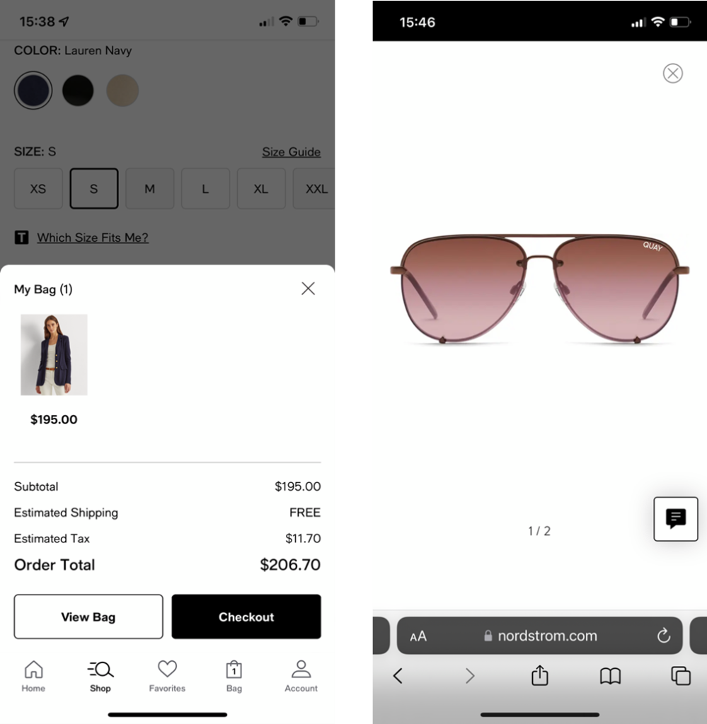
Macy’s app (left) used a partial overlay for displaying the shopping cart, while Nordstrom.com (right) used a full overlay for showing product images.
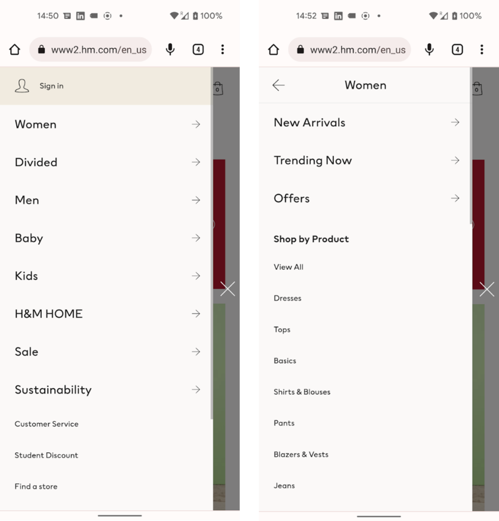
HM.com used a partial overlay to implement the sequential menu used for the main navigation.
Facebook for iOS: Tapping on an article in the newsfeed (left) displayed it in a full-page overlay (right).
Depending on whether the user can interact with the background (that is, with the content beneath the overlay), overlays can be modal or nonmodal. In modal overlays, users cannot interact with the background, while in nonmodal overlays, they can do so.
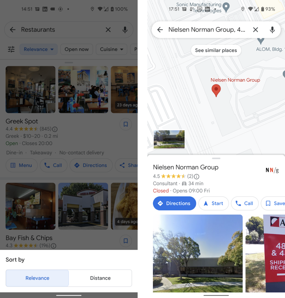
The Google Maps mobile app used a modal overlay to display sorting options (left) and a nonmodal overlay for displaying information about a particular location (in this case, Nielsen Norman Group — right). Both these overlays are examples of bottom sheets — application-specific overlays that appear at the bottom of the screen.
One of the major problems with mobile overlays is that dismissing them can be done through one of the following overlay-dismissal methods:
- a dedicated button included in the overlay (usually a Close or a Back button)
- tapping outside the overlay area, in the case of modal overlays that do not take up the whole page
- swiping down on the overlay handle, in the case of bottom sheets
- the browser’s Back button (on the web)
- the horizontal swipe gesture used for Back on both iOS and Android (or the phone’s Back button for Android phones)
Because designers vary in which of these overlay-dismissal methods they’ll allow, users sometimes will pick the wrong method, with unexpected and costly consequences. Things are even more complicated when several overlays are stacked on top of each other — in those cases, an overlay-dismissal method may dismiss only the top overlay or the entire stack, with no easy way for users to predict which behavior they’ll get.
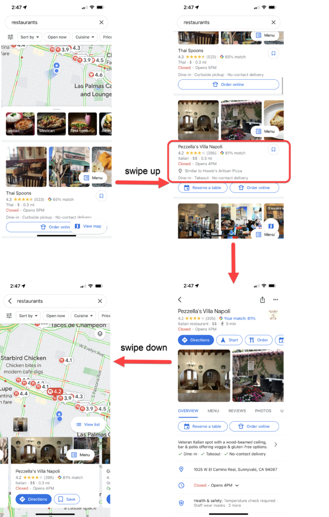
Let’s start with an example. In a recent usability study, we had 8 participants interact with a variety of mobile sites and applications that used overlays. One of our study participants used Walmart’s mobile app to shop for a light fixture. When the participant selected a product from the product-listing page, the product description was shown in an overlay.
In that overlay, he further tapped on Customer reviews, which displayed another overlay on top of the first one. To go back to the product description, the participant tapped the Close icon at the top. Unfortunately, that action dismissed the stack of overlays, and the participant was taken back to the list of products, losing his selection. Through no fault of his own, the participant had picked the wrong overlay-dismissal method. In order to navigate back, he was supposed to use either the on-screen Back button or the horizontal swipe gesture.
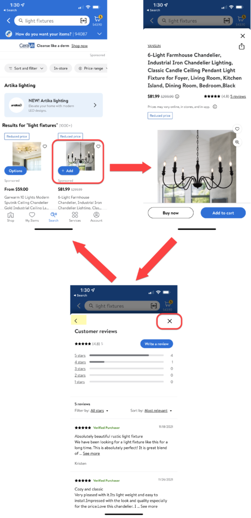
Walmart mobile app: When our study participant selected a product from a list of products (top left), it was shown in an overlay (top right). The Customer reviews for that product were displayed in another overlay (bottom left), on top of the previous one. When the user tapped the x icon to go back to the product page, he was instead taken to the product-listing page (top left). The “correct,” designer-approved method for closing the Customer reviews overlay was the on-screen back arrow (highlighted in yellow) or the horizontal swipe gesture.
Overlay-Dismissal Problems
This example illustrates several of the major problems commonly associated with overlays, which are:
- Users pick the wrong overlay-dismissal method.
- Users’ work is lost.
- Stacked overlays amplify confusion.
Users Pick the Wrong Overlay-Dismissal Method
The participant in the Walmart example could have used any of the overlay-dismissal methods to get out of the Customer reviews overlay and back to the product-detail overlay: swiping down, swiping horizontally on the left edge of the screen, tapping out, or pressing one of two on-screen buttons: close (x) icon or the Back arrow. He had no way to predict which one would get him his desired result. He guessed the close (x) button, but (unbeknownst to him) the designers had chosen the Back arrow or the horizontal Back swipe for that functionality.
Another common scenario where users may use the wrong method is when overlays look like full pages. In that case, users may use the browser or phone’s Back button, or the horizontal swipe gesture to go back to the previous view. But, because the overlay is not technically a separate page and because the Back button (at least in its standard implementation) takes people back to the previous page (and not to the previous view), the result is that users are thrown back farther than they expected. This outcome contributes to a sense disorientation and a lack of control.
That was what happened with another one of our study participants, who was using the LinkedIn app to look for jobs. She searched for GSK, a company that she was familiar with, and went to the company’s webpage within LinkedIn’s in-app browser. On that page, she opened the main navigation menu and selected Careers. She then went on to explore a subcategory (Experienced professionals), but because it was unsatisfactory, she decided to go back up in the menu. However, instead of using the menu’s <Careers button (as designers wanted her to), she used her Android phone’s Backbutton. That gesture closed the in-app browser and took the user all the way back to the company’s LinkedIn page, dismissing the menu in the process and making the user lose all her hard work.

LinkedIn Android app: The participant tapped the link from the GSK page (top left) and was shown gsk.com in an in-app browser (top right). She opened the sequential menu (bottom right), selected Careers, then Experienced Professionals (bottom left), and then used the phone’s Back button to try to go up a level, back to Careers. But that action took her back to GSK’s Linked in page (top left). The user was supposed to use the on-screen <Careers button (highlighted in the bottom left screenshot) instead.
In both the Walmart and the LinkedIn/GSK example, the “correct” button from the designers’ perspective (the on-screen Back button) was visible on the screen, but it had competition from two other buttons commonly used for navigating away from a view (the X icon, in the case of the Walmart user, and the phone’s Back button for the LinkedIn user).
It’s even more confusing when there are multiple buttons on a page that are labeled in the same way, yet do different things. For example, one Instagram user opened Lowes’s website in an in-app browser shown in an overlay. He visited a product page, which used a different overlay to display available customizations for that product. Both the browser overlay and the product-customization overlay had an x icon that was intended to close the respective overlay. But the user, wanting to go back to the product page, accidentally picked the wrong one and was taken back to the Instagram view instead.
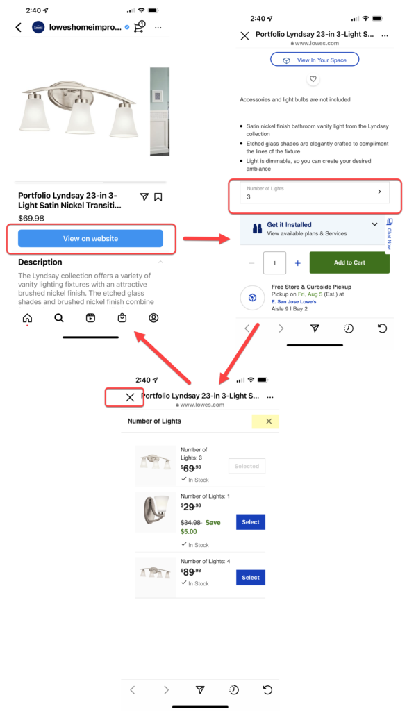
A participant shopping on Lowes’s Instagram shop page tapped View on website (top left) to see more product details on Lowes’s site. He was shown the product page in an in-app browser (top right) and, on that page, tapped Number of Lights, which opened up another overlay (bottom). When the user wanted to close that second overlay, instead of using the right x icon (highlighted), he tapped on the left, bigger X, which closed the browser window and took him back to the Instagram shop (top left).
If you provide the user with multiple ways of navigating away from the current view (the swipe gesture, the phone’s Back button, an on-screen Back button, one or more Close buttons) and some of these methods have different effects, there is no guarantee that users will use the right method. When they accidentally choose the wrong method, they’ll be confused and annoyed.
The User’s Work Is Lost
A major reason why choosing the “wrong” overlay-dismissal method can be frustrating is that the mistake often results in lost work for users. When they accidentally move farther back in the process than they mean to, users have to start all over again — or give up. The participant in our Walmart example was taken out of his flow and had to start all over, finding the same product again. This same problem happened with our LinkedIn and Instagram users. Another situation where it’s easy for users to lose work is if they accidentally tap outside of a partial overlay, thus dismissing it. For example, on Overstock.com, if the user accidentally taps outside the modal overlay used for the sequential menu, all their selections of subcategories in that menu will be lost.
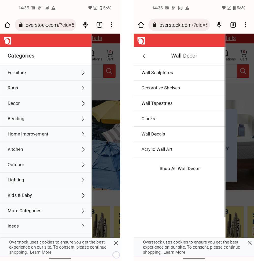
Overstock.com used a sequential menu for the site main navigation: users had to select a main category such as Decor (left), and then a level-two subcategory such as Wall Decor, and so on (right). An accidental tap outside the menu would close it and lose the current view of the selected subcategory.
Stacked Overlays Amplify Confusion
A big part of the problems encountered by our Walmart and Instagram users was that there were several layers of overlays on top of each other. The users did not keep track of the many layers and accidentally dismissed the whole stack instead of just the last layer. This is a very frequent occurrence. It tends to happen often when in-app browsers function as overlays but can occur in other situations as well.
For example, another one of our participants used Google Maps to look for local restaurants. The list of restaurants was displayed in a bottom-sheet overlay on top of a map. That bottom sheet could be expanded to take up the whole page. However, when the participant selected one restaurant, its detail page was shown in yet another overlay on top of the first one. To go back to the list of restaurants, the participant used the swipe-down gesture (normally used to close a bottom sheet). But that resulted in closing all the sheets in the stack and taking the user back to the map view of the restaurants, which he did not recognize.
Google Maps iPhone app: A search for restaurants showed a map and a list of restaurants displayed in a bottom sheet (top left). As the user scrolled down the list, the bottom sheet expanded to take up the full page (top right). After the participant tapped on a restaurant, its detail page was shown in a full-page bottom sheet on top of the listing-page overlay (bottom right). When he swiped down to close the restaurant view and go back to the list of restaurants, the whole stack of overlays was lost and the user went back to the map (right). The participant was confused because he expected to see his restaurant list (like in the top right screenshot), so he went back to redo his search again.
How to Prevent Overlay-Dismissal Problems
Use an Alternative Pattern
The easiest way to avoid overlay issues is to simply avoid using overlays where possible. Some content is best presented in an overlay, especially when you need to present information in-context. Google Maps’ listing page is a good example of a necessary overlay — the map needed to stay in-view as the user browsed restaurants. But in other cases, overlays are very much unnecessary — for example, Walmart’s product details could easily be in separate pages (as in the Revolve app below) and customer reviews could be either shown on a separate page (also like in the Revolve app) or collapsed in an expandable accordion (as in the Nordstrom app).
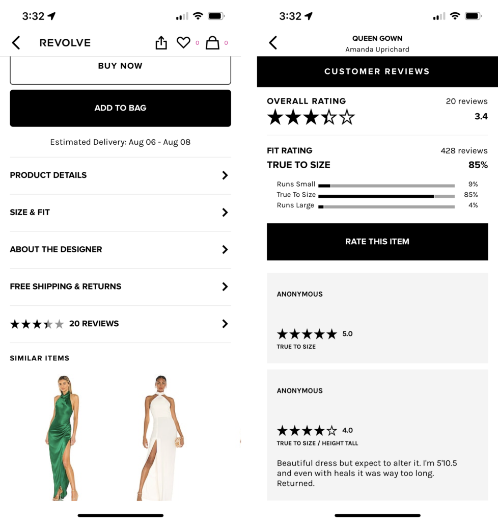
The Revolve mobile app used separate pages to display product details (left) and reviews (right).
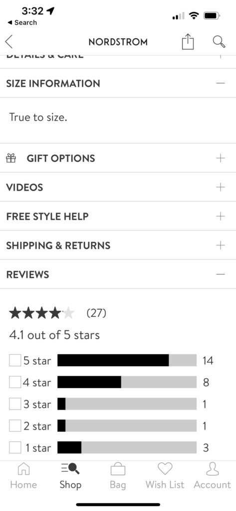
The Nordstrom app used accordions to display reviews and other item-related information,
Prefer Partial to Full-Page Overlays
This is an especially good idea when the overlay contains only relatively little content that does not require scrolling. In general, if users realize that they are dealing with an overlay rather than a regular page, they will be less likely to try to use the browser’s Back button to go back.
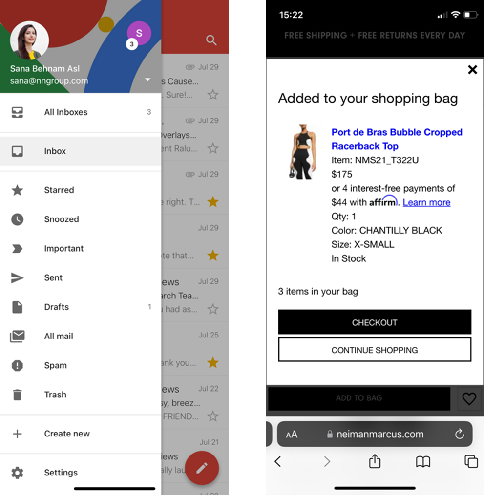
Partial overlays like the ones used by Gmail (left) and NeimanMarcus.com (right) are easy to recognize and such and less likely to tempt the user to dismiss them by using the browser’s or the phone’s Back button.
However, if your partial overlay requires users to scroll, you may be forcing users to do more work than necessary by not taking advantage of the full screen space. You also make it more likely that they will lose their spot on the page if they accidentally close the overlay.
Do Not Use Stacks of Overlays
Even if you end up using the occasional overlay, stay away from overlays on top of overlays, since they increase the chance that the user will accidentally close the whole stack and lose their work.
Include a Close Button for Dismissing the Overlay
Overlays that had a clear X button were less likely to be closed accidentally (provided that no other Close buttons were also shown on the screen). Consider including one of these buttons instead of assuming that users will use gestures like swipe down to close the overlay.
With bottom sheets, do not assume that users will know to swipe down in order to close the bottom sheet. Even though that gesture needs to be supported, you should also allow users to dismiss the overlay using a visible X button.
The Best buy app used a clear X button on the top left for full overlays for previewing the product image (left) or adding the item to the cart (right).
The Built-In Back Button Should Close the Overlay
Instead of taking the risk that user will accidentally use their browser or phone’s Back button or the horizontal swipe gesture to close an overlay, support the use of the built-in Back for dismissing the overlay.
Thus, you should allow users to use the browser or the phone’s Back button or gesture to act as undo and move back from the current view to the previous one.
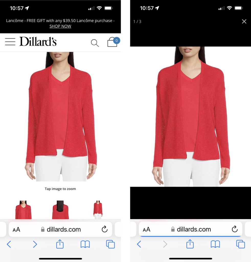
Dillards.com supported the use of the browser’s Back button to dismiss the full overlay (right) and go back to the product’s detail page (left).
Conclusion
Overlays are a popular design element on mobile, used for displaying both UI components (e.g., navigation menus) and content. Unfortunately, they can lead to some serious usability issues: they can be dismissed accidentally, thus causing users to lose work and have to retrace their steps in the interface. Stacks of overlays are particularly likely to be closed by mistake.
We recommend that designers stay away from overlays whenever possible and instead attempt to use a different design component (like an accordion or a full page). If overlays must be used, create clear signifiers that allow users to differentiate them from regular pages, display only limited content inside the overlay. For all overlays (including bottom sheets), support the following two methods for dismissing the overlay: a clear Close button and the built-in (phone’s or browser’s) Back button or Back gesture.
Acknowledgments
We thank Mayya Azarova, Megan Brown, and Lillian Yang for helping run the test sessions. We also thank Megan Brown for helping tag the qualitative data from the sessions.
About This Article:
A Life Worth Living has copied the content of this article under fair use in order to preserve as a post in our resource library for preservation in accessible format. Explicit permission pending.
Link to Original Article: https://www.nngroup.com/articles/accidental-overlay-dismissal/