Accessibility user testing: a cautionary tale
By Daniel Pidcock | UX Collective, July 9, 2018
An online food ordering service should be awesome for deaf people, right? I thought so. Find out why I was wrong and how I learned the importance of user testing with disabled people.
A bit of background
I was working on a global takeaway food ordering platform where I had accidentally become head of the accessibility team.
*Record scratch* *Freeze frame* You are probably wondering how I ended up here.
When I joined this company they didn’t have anyone specifically looking after accessibility. They had many talented designers and developers, many of whom understood and tried to make their work as accessible as possible. But there was no official accessibility design, development or testing process and as such there were many serious issues. I raised this with the senior management and they immediately gave me the budget and autonomy to get this fixed.
I think they should be proud of this. They may have failed badly at being accessible for a long time (as almost every other brand continues to do*), but as soon as they realized they weren’t meeting their legal and ethical responsibilities they got it sorted.
*70% of websites don’t meet minimum AA WCAG compliance.
Shortly after we started this process the company went through a rebrand. Accessibility was the very first requirement in the brief!
I think they should be proud — very proud. There is no shame in being wrong, and it’s a great thing to endeavour to be better. However, this is why I’m not naming the brand specifically: When I expressed the wish to talk publicly, about the journey we went on and what we learned, the Head of UX was worried it would reflect badly on the company.
Well, I’m no longer there — and nor is the Head of UX — so I hope as long as I don’t mention the company there will be no problem telling this story.
Anyway — as I say — they should be proud.
Back to the story
We had just gone through a full accessibility audit and were deep into the process of fixing the issues and I was feeling pretty chuffed that the platform was now a lot more accessible.
One evening I was scrolling through Facebook and came across a promoted post from the brand. I always love looking at the comments to see what people are saying as this can be an enlightening insight into our customer’s views and, sadly, data we rarely got fed back from the marketing team.
There was a post from a deaf woman who stated quite simply:
“[Brand] is terrible for deaf people like me.”
Even if I wasn’t leading the accessibility team that comment would have floored me.
I mean, it’s a service which allows people to order food online, without the need of calling anyone. Surely we were the greatest thing EVER for any deaf person who enjoyed a good curry?!
I clicked on her profile and popped her a private message saying something along the lines of, “I saw your comment on [brand’s] post. I work for them on accessibility and would love to know more about the problems you’ve faced and how we can improve the service.”
To her credit, she replied almost instantly to the strange man messaging her late at night on Facebook.
We had a long conversation and — wow — my eyes were opened!
We were terrible for deaf people
One of the first things we demanded when making an order was for their phone number. Some deaf people don’t have a phone. So they might enter a random set of numbers. The system would then flag these obviously phony phone numbers as a fake order… Fail #1.
And we needed these phone numbers. Should the restaurant have run out of a certain dish, need to clarify the order, or any number of reasons, they would call the customer using this number. If they couldn’t get through they would ask our customer support team to get in touch… guess what… by phone! Fail #2.
Of course we didn’t have an alternative. It simply hadn’t occurred to anyone in the ten years we had been operating that some people might not be able to make and receive phone calls. I don’t think it would have occurred to me if it wasn’t for this brief chat with a deaf lady.
Next, let’s assume the food has been made — without the order being flagged as fake and no need to call the customer — so it’s now with the delivery driver on its way to the rumbling tummies that await.
The customer kindly left a comment on the ‘restaurant notes’ to tell the driver to use the doorbell and not to knock. Deaf people can’t hear a door knock, instead, this lady has a special doorbell that flashes instead of ringing inside the house. Unfortunately, the restaurant notes are at the very top of a very long receipt and the address is at the bottom. Usually this receipt is folded and stapled to the bag so it would be impossible for a driver to see this comment. Even if it wasn’t folded, the harangued and busy driver probably wouldn’t think to look.
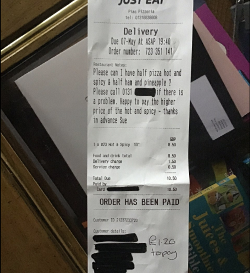
So the driver knocks… and knocks… then calls the customer… and get’s no answer. Fail #3.
The first the customer knows of all this is when she eventually wonders where her food is, checks online to see that the order has been canceled and her account flagged for possible fake orders.
She messages the customer support, who speak to the restaurant, who replies with a shrug. It’s a Friday night and they have more orders than they can handle. They’d rather lose one deaf customer than risk the hundreds of other orders they have waiting.
Our hangry customer grabs a frozen pizza, turns on the oven, and vows never to use our service again. Fail #∞
I’m not angry, I’m just disappointed
Remember this is what the world is like for people with disabilities. A world designed for the 80% who are able-bodied.* Full of hurdles that make life difficult and sometimes impossible. Things that would be easy to solve if those of us who design these products and services just looked a bit wider than our own myopic experiences and understood disabled peoples needs.
*One in five adults have a registered disability in the UK. That rises to 50% of pension age adults.
The thing is: Improving our service for the 20% actually improves things for the 80% too.
In fact, this has become key in my work ever since understanding accessibility better: When you design for people with the most extreme needs you make life better for everyone.
Let’s take some of the fails above, starting with asking for a phone number as the main point of contact: We’ve seen how it seriously affects someone who is deaf and might not have a phone number. But having an alternative form of contact would help others too. Imagine a hearing person who just placed an order then decided to call her friend for a natter. How are we going to get hold of her?
Many people use food ordering services rather than the traditional phone method because they have social anxiety. I know many people who aren’t socially anxious yet still treat answering the phone as a fearful enterprise.
What if the user simply mistyped their number?
Lack of alternatives fail people in a lot of situations.
Next, how about the note to the driver that is near impossible for them to see?
In this case, it meant that the driver didn’t know to use the doorbell because the resident is deaf. But you don’t need to be deaf not to hear a knocking or even the doorbell. What if the customer was having a party? Music is loud or they are in the garden with their friends — a common situation for a takeaway delivery. These people have what we call a ‘situational limitation’. Like a disability but temporary.
Of course, the note to the driver does not need to be anything to do with hearing. For example: the numbering of the houses on the road I live on makes very little sense. It normally takes at least three visits before a driver finds our house first time (and without a phone call for directions). This is very common in the UK as roads are developed over hundreds of years. It’s even more common in Italy where most people don’t know their postcode and addresses are often ‘Down the road from old Mrs Russo, to the left of the big rock’.
Once again — if we can have a note that is aimed directly at the driver we will improve the experience massively for thousands of drivers and millions of customers, not just the people who need it most.
User testing is always eye-opening — user testing with disabled people doubly so.
A great deal of the products we rely on every day were originally designed with disabled people in mind: For instance TV remote controls. I’m perfectly capable of getting up to switch channels or adjust the volume (and remember the days when you had no choice), but I’d not buy a new TV that didn’t come with a remote.
Other examples include escalators, hot tubs, Teletext, eye tracking, typewriters (and thus keyboards), voice to text technology (and thus Siri and Alexa).
All these were designed to solve an accessibility problem and now make everyone’s lives better. What opportunities are you missing when designing your product?
When you test with people with extreme needs you learn extremely useful things.
If you’re convinced but are not sure where to start with accessibility user testing, I can recommend The Shaw Trust. They are a registered charity who employ disabled user testers who can provide insights from real first-hand experience. They do an awesome job and are well priced.
Let me know what you learn.
About This Article:
A Life Worth Living has copied the content of this article under fair use in order to preserve as a post in our resource library for preservation in accessible format. Explicit permission pending.
Link to Original Article: https://uxdesign.cc/disabled-user-testing-a-cautionary-tale-b6cf64425adb